One of the best Websites out there, in terms of functionality, is Amazon.
In terms of accessibility, though, it's not great.
The Problem
Amazon's menu tabs, with their nice round corners, look good -- but they're totally inaccessible. First of all, they're missing ALT tags. Additionally, the W3C accessibility guideline 3.1 (priority 2) clearly states:
When an appropriate markup language exists, use markup rather than images to convey information.
This basically means that we shouldn't use images to display text. Users with poor vision are unable to resize text that's displayed through images. Similarly, users of screen magnifiers may be unable to read text embedded in images, as it can appear blurry and pixelated to them.
The Solution: CSS Menu Tabs
CSS, as usual, comes to our rescue. Look at this menu tab, created through HTML and CSS -- not an tag in the SitePoint HTML Reference." href="http://c-lien.blogspot.com/?aHR0cDovL3JlZmVyZW5jZS5zaXRlcG9pbnQuY29tL2h0bWwvaW1n"> tag in sight!
1388_home1 (click to view image)
Have a look at it in action -- when you do, adjust the text size in your browser. Notice that the menu tab increased in size with the text: it all fits perfectly.
Today, you're going to learn how to do this.
How It's Done
We start with a simple link:
We'll assign it this CSS code:
#navigation a

{

color: #000;

background: #fb0;

text-decoration: none

}
This gives us the following result:
1388_home2 (click to view image)
It needs a bit of work, right? Let's do it.
Add the Left Menu Tab Corner
We need to make a small image with the same colour for the rounded left-hand corner. Here's one I made earlier.
1388_taborangeleft (click to view image)
Let's call this image left-tab.gif and place it into the background of the link using this CSS rule:
#navigation a

{

color: #000;

background: #fb0  url("left-tab.gif") left top no-repeat;

text-decoration: none

}
This new CSS rule says that the background image should be left-menu-tab.gif, the image should be on the left at the top, and it shouldn't be repeated. The result?
1388_home3 (click to view image)
We're getting there, but we need to move the text over slightly as it's overlapping the left rounded corner. It's pretty simple to reposition the text with the addition of padding to our CSS rule:
#navigation a

{

color: #000;

background: #fb0  url("left-tab.gif") left top no-repeat;

text-decoration: none;

padding-left: 10px

}
1388_home4 (click to view image)
The Right Corner
We can only assign one background image to a CSS rule, so we need to make a new CSS rule and assign the right corner image to that. We'll start by inserting a tag in the SitePoint HTML Reference." href="http://c-lien.blogspot.com/?aHR0cDovL3JlZmVyZW5jZS5zaXRlcG9pbnQuY29tL2h0bWwvc3Bhbg=="> tag into the HTML code:
Now we'll create a new CSS rule in which we'll assign the right menu tab shown below (another one I made earlier) to the tag in the SitePoint HTML Reference." href="http://c-lien.blogspot.com/?aHR0cDovL3JlZmVyZW5jZS5zaXRlcG9pbnQuY29tL2h0bWwvc3Bhbg==">, and we're ready to go!
1388_taborangeright (click to view image)
We'll name this image right-tab.gif.
#navigation a span

{

background: url("right-tab.gif") right top  no-repeat;

}
This CSS rule means that every tag in the SitePoint HTML Reference." href="http://c-lien.blogspot.com/?aHR0cDovL3JlZmVyZW5jZS5zaXRlcG9pbnQuY29tL2h0bWwvc3Bhbg=="> tag within an tag in the SitePoint HTML Reference." href="http://c-lien.blogspot.com/?aHR0cDovL3JlZmVyZW5jZS5zaXRlcG9pbnQuY29tL2h0bWwvYQ=="> tag will have this image as its background. The final result looks like this:
1388_home5 (click to view image)
Perfect... No, wait a minute! Can you spot why it's not so perfect? We forgot to assign some padding to that tag in the SitePoint HTML Reference." href="http://c-lien.blogspot.com/?aHR0cDovL3JlZmVyZW5jZS5zaXRlcG9pbnQuY29tL2h0bWwvc3Bhbg=="> tag in the CSS rule:
#navigation a span

{

background: url("right-tab.gif") right top  no-repeat;

padding-right: 10px

}
This code gives us:
1388_home1 (click to view image)
Now, that really is perfect! Have a look at the results here and resize the text to see how it looks.
The Final CSS Touches
Let's assign this link a nice hover effect using a few final CSS rules. We'll need a couple more background images:
1388_tabblueleft (click to view image)
We'll call this left-tab-hover.gif.
1388_tabblueright (click to view image)
This one's named right-tab-hover.gif.
Now, we just insert the following CSS rules, and away we go!
#navigation a:hover {

color: #fff;

background:  #fb0 url("left-tab-hover.gif") left top no-repeat;

text-decoration: none;

padding-left: 10px

}


#navigation  a:hover span

{

background:  url("right-tab-hover.gif") right top no-repeat;

padding-right: 10px

}
Have a look at this code in action -- be sure to mouse over it!
Make a Tab Menu
Now we've done all the hard work, we can make as many of these menu tabs as we want:
1388_nav (click to view image)
See the nav in action -- be sure to mouse over the nav items!
Looks great, doesn't it? Note, though, that building your menu this way does bring up a new accessibility problem: this navigation won't make sense to anyone who has disabled CSS. Without CSS, the navigation looks like this:
1388_nocssnav (click to view image)
That's quite a problem. The solution? Let's put the tabs into a list! The HTML will look like this:
<ul id="navigation">

<li>Home</li>

<li>Services</li>

<li>Take a  tour</li>

<li>About  us</li>

<li>Contact  us</li>

</ul>
Now, let's create some CSS rules for our list items, so that all the menu tabs display next to one other on the same line:
#navigation

{

list-style: none;

padding: 0;

margin: 0;

}


#navigation li

{

float: left;

display: block;

margin: 0;

padding: 0;

}
To get rid of the bullets, we used the CSS command, list-style: none. To display our menu tabs inline, stacked next to each other, we used float: left.
At this point, some of the more expert CSS coders may question the point of keeping the tag in the SitePoint HTML Reference." href="http://c-lien.blogspot.com/?aHR0cDovL3JlZmVyZW5jZS5zaXRlcG9pbnQuY29tL2h0bWwvc3Bhbg=="> tag, especially those who've read Doug Bowman's Sliding Doors article. The reason we leave in the tag in the SitePoint HTML Reference." href="http://c-lien.blogspot.com/?aHR0cDovL3JlZmVyZW5jZS5zaXRlcG9pbnQuY29tL2h0bWwvc3Bhbg=="> tag is to make the entire menu tab clickable. If we were to assign one of the corners to tag in the SitePoint HTML Reference." href="http://c-lien.blogspot.com/?aHR0cDovL3JlZmVyZW5jZS5zaXRlcG9pbnQuY29tL2h0bWwvbGk="> as a background image, that corner wouldn't be clickable.
IE 5.x Problems
Unfortunately, these tabs won't work on IE 5.0 on PC (and a couple of other browsers), as the rounded edges of the tabs don't appear. As such, each menu tab will be displayed as a rectangle, with sharp corners. There's an easy solution to this, which is to insert display: block into the #navigation a and #navigation a span CSS commands.
Sounds easy, right? Unfortunately, it's not. By inserting these commands into the CSS, IE 5 on Mac will stack the menu items on top of each other. To make these display properly for IE 5 on Mac, we'll need to also insert the float:left command, but apply it only to this browser. But how do we apply a CSS command to just one browser? Easy -- we use the commented backslash hack:
#navigation a, #navigation a span

{

display: block;

float: left

}


/* Commented backslash hack hides  rule from IE5-Mac \*/

#navigation a, #navigation  a span

{

float: none

}

/* End IE5-Mac hack */
The first CSS command says to float the menu tab content to the left, and the second CSS command cancels this out for every browser except IE 5 on Mac. When two CSS commands are specified for the same selector, the second one always takes precedence. However, IE 5 on Mac can't read the second command because of the slashes and stars, so defaults to the first CSS command. (If you really want to know how and why this works, read Commented Backslash MacIE5 CSS Hack by Sam Foster.)
The Final Code
The final HTML is:
And here's the entire CSS code:
#navigation a

{

color: #000;

background: #fb0  url("left-tab.gif") left top no-repeat;

text-decoration: none;

padding-left: 10px

}


#navigation a span

{

background:  url("right-tab.gif") right top no-repeat;

padding-right: 10px

}


#navigation a, #navigation a span

{

display: block;

float:  left

}


/* Commented backslash hack hides rule from IE5-Mac \*/

#navigation a, #navigation a span

{

float: none

}

/* End  IE5-Mac hack */


#navigation a:hover

{

color: #fff;

background: #26a url("left-tab-hover.gif") left top no-repeat;

text-decoration: none;

padding-left: 10px

}


#navigation  a:hover span

{

background: url("right-tab-hover.gif") right top  no-repeat;

padding-right: 10px

}


#navigation

{

list-style: none;

padding: 0;

margin: 0

}


#navigation li

{

float: left;

display: block;

margin: 0;

padding: 0

}
The End Product... With and Without CSS
Let's look at it one more time. First, the CSS version of the nav:
1388_nav (click to view image)
When CSS is disabled, it looks like this:
1388_navdisabled (click to view image)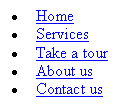
Now, that really is accessible!
Aucun commentaire:
Enregistrer un commentaire