This article helps to understand how CSS is changed automatically when a button is disabled from the server side. Further, how to define CSS when a user hovers over an element.
Step 1: Define CSS for button
Define two css (i.e. one for hover and another normal) for each button.
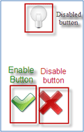
Button1: Which will enable 3rd button
Button 2: Which will disable 3rd button
Button 3: Which will be enabled and disable by 1st and 2nd button.
All buttons in Normal/Enabled state
READ MORE >>
http://www.c-sharpcorner.com/UploadFile/e1317f/7220/
Step 1: Define CSS for button
Define two css (i.e. one for hover and another normal) for each button.
Button1: Which will enable 3rd button
- CSS for button1 when it is hovered by the user. Here CButtonMakeEnable:hover
does it all; :hover defines what css is applied when an element is hovered.
.CButtonMakeEnable:hover {
background: url("Images/buttonMakeEnableHover.png");
background-repeat: no-repeat;
background-position: top right;
background-color: transparent;
cursor: pointer;
border: 0px;
height: 48px;
width: 48px;
}
- CSS for button1 when it is not hovered by the user. Here the css is defined for normal behavior.
.CButtonMakeEnable {
background: url("Images/buttonMakeEnableNormal.png");
background-repeat: no-repeat;
background-position: top right;
background-color: transparent;
cursor: pointer;
border: 0px;
height: 48px;
width: 48px;
outline-width: 0px;
}
Button 2: Which will disable 3rd button
- CSS for button2 when it is hovered by user. Here .CButtonMakeDisable:hover does it all; :hover defines what css is applied when an element is hovered.
.CButtonMakeDisable:hover {
background: url("Images/buttonMakeDisableHover.png");
background-repeat: no-repeat;
background-position: top right;
background-color: transparent;
cursor: pointer;
border: solid 0px #ff0000;
height: 48px;
width: 48px;
}
- CSS for button2 when it is not hovered by the user. Here the css is defined for the normal behavior.
.CButtonMakeDisable {
background: url("Images/buttonMakeDisableNormal.png");
background-repeat: no-repeat;
background-position: top right;
background-color: transparent;
cursor: pointer;
border: solid 0px #ff0000;
height: 48px;
width: 48px;
outline-width: 0px;
}
Button 3: Which will be enabled and disable by 1st and 2nd button.
- CSS for Enabled button3. This is defined for the normal behavior when the button is enabled.
.CButton{background-image: url("Images/bulbEnable.png");background-repeat: no-repeat;background-position: top right;background-color: transparent;cursor: pointer;border: solid 0px #ff0000;height: 48px;width: 48px;outline-width: 0px;
}
- CSS for disabled button3, when the button is disabled. Here .CButton[disabled] does it all; this ccs is automatically applied when the element is disabled.
.CButton[disabled]{background: url("Images/bulbDisable.png");background-repeat: no-repeat;background-position: top right;background-color: transparent;cursor: pointer;border: solid 0px #ff0000;height: 48px;width: 48px;
}
All buttons in Normal/Enabled state
READ MORE >>
http://www.c-sharpcorner.com/UploadFile/e1317f/7220/
Aucun commentaire:
Enregistrer un commentaire