CSS3? What's that?!
I'm sure you've heard of CSS in general. CSS3 isn't that much different, in terms of syntax; however, the power of CSS3 is much greater. As you'll see in these eleven techniques, you can have multiple backgrounds, dynamically resize those backgrounds, border radiuses, text shadows, and more!
Here's what the official (or at least, what I consider official) website of CSS3, css3.info, has to say about CSS3:
CSS3 is the new kid in the stylesheet family. It offers exciting new possibilities to create an impact with your designs, allows you to use more diverse style sheets for a variety of occasions and lots more.
What We'll Be Covering
Here are the 11 techniques that I'll be showing you how to recreate with CSS3. I'll show you how to create them using CSS2 (or JavaScript), and then with CSS3 properties. Remember - these effects will only work in modern browsers that implement these CSS3 features. Your best option is to view these with Safari 4.
- Rounded Corners
- Box Shadow
- Text Shadow
- Fancy Font
- Opacity
- RGBA
- Background Size
- Multiple Backgrounds
- Columns
- Border Image
- Animations
1. Rounded Corners
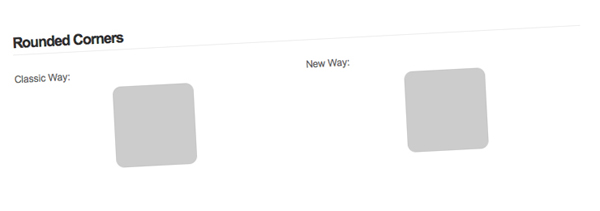
Probably my favorite on of this list, rounded corners provide a developer with so many options. You can create a rounded corner button in seconds. My favorite thing to do is set a gradient background to repeat along the x-axis and then apply rounded corners to make a very nice looking Web 2.0 button.
You can simulate rounded corners by using four extra divs or by using JavaScript. Though, a user doesn't see these smooth corners if they have JavaScript disabled, I think that's fine as long as the website still functions as it should. You can read up on this method if you would prefer to use pure CSS in making rounded corners.
Classic Way
- <script type="text/javascript" src="http://ajax.googleapis.com/ajax/libs/jquery/1.3.2/jquery.min.js"></script>
- <script type="text/javascript" src="js/jquery.corners.js"></script>
- <script type="text/javascript">
- $(function(){
- $('.box').corners('10px');
- });
- </script>
- <div class="box">
- <!--CONTENT-->
- </div>
The classical method uses jQuery along with a JavaScript plugin called Corners.
CSS3 Way
- <style type="text/css">
- .box {
- border-radius: 10px;
- -moz-border-radius: 10px;
- -webkit-border-radius: 10px;
- }
- </style>
- <div class="box">
- <!--CONTENT-->
- </div>
As you can see, all that you need to do is specify three CSS3 properties. Eventually, it will only be one; you have to use three now because different browsers use different property names.
2. Box Shadow
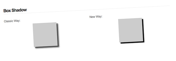
Box shadows provide you with a very powerful tool. 99% of the time when I'm desigining, I find myself using drop shadows for something. Once again, I'll be using a jQuery plugin to take care of the classic way because honestly, trying to figure it out with just CSS is confusing. Why should I waste my time fiddling with negative margins when there's already something written that does the job for me? As long as my design looks fine when people have JavaScript disabled, I'm perfectly content using a jQuery plugin.
Classic Way
- <script type="text/javascript" src="http://ajax.googleapis.com/ajax/libs/jquery/1.3.2/jquery.min.js"></script>
- <script type="text/javascript" src="js/jquery.dropShadow.js"></script>
- <script type="text/javascript">
- $(function(){
- $('.box').dropShadow({
- left: 5,
- top: 5,
- opacity: 1.0,
- color: 'black'
- });
- });
- </script>
- <div class="box">
- <!--CONTENT-->
- </div>
I'm using the dropShadow plugin. Simple and what I wanted; though I would prefer to use just CSS ;).
CSS3 Way
- <style type="text/css">
- .box {
- box-shadow: 5px 5px 2px black;
- -moz-box-shadow: 5px 5px 2px black;
- -webkit-box-shadow: 5px 5px 2px black;
- }
- </style>
- <div class="box">
- <!--CONTENT-->
- </div>
The values for the box shadow properties are: x-offset y-offset blur color. Much easier than importing two JavaScript files, and A LOT easier than messing around with background images and negative margins.
3. Text Shadow
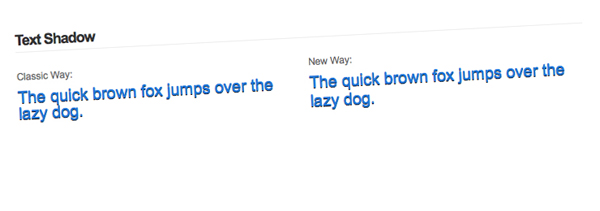
If you've ever read a tutorial about how to make the letterpress effect in Photoshop, you'll know that the drop shadow effect is used. It's really simple to create letterpressed text, just follow this tutorial at Line25 by Chris Spooner.
Classic Way
- <style type="text/css">
- .font {
- font-size: 20px;
- color: #2178d9;
- }
- .fonts {
- position: relative;
- }
- .fonts .font {
- position: absolute;
- z-index: 200;
- }
- .fonts .second {
- top: 1px;
- color: #000;
- z-index: 100;
- }
- </style>
- <div class="fonts">
- <span class="font">The quick brown fox jumps over the lazy dog.</span>
- <span class="font second">The quick brown fox jumps over the lazy dog.</span>
- </div>
Instead of using a jQuery plugin this time, I just used some simple CSS tricks to absolutely position the text behind the other copy of text. The only bad thing about not using CSS3 for this situation is that you will get two copies of the text if CSS is disabled.
CSS3 Way
- <style type="text/css">
- .font {
- font-size: 20px;
- color: #2178d9;
- }
- .font {
- text-shadow: 0 1px 0 #000;
- }
- </style>
- <span class="font">The quick brown fox jumps over the lazy dog.</span>
If you're planning on using text shadows that are blurred (the third "option" in the text-shadow property), I don't know how you would accomplish that with pure CSS, and no images.
4. Fancy Font
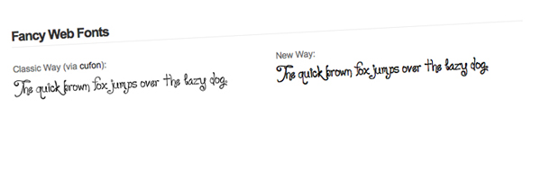
We've dreamed about it for a long time now, but you can finally display "fancy fonts" on the web without relying on JavaScript. Of course this causes some issues with allowing paid fonts to be distributed over the internet. Anyhow, I present you with @font-face.
Classic Way
- <script type="text/javascript" src="http://ajax.googleapis.com/ajax/libs/jquery/1.3.2/jquery.min.js"></script>
- <script type="text/javascript" src="js/cufon.js"></script>
- <script type="text/javascript" src="js/loyal.js"></script>
- <script type="text/javascript">
- $(function(){
- Cufon.replace('.classic .font');
- });
- </script>
- <style type="text/css">
- .font {
- font-size: 20px;
- }
- </style>
- <span class="font">The quick brown fox jumps over the lazy dog.</span>
I decided to use Cufón to replace the text. I'm not going to explain how to use it because Jeffrey has an awesome screencast already.
CSS3 Way
- <style type="text/css">
- @font-face {
- font-family: 'Loyal';
- src: url('loyal.ttf');
- }
- .font {
- font-family: Loyal;
- font-size: 20px;
- }
- </style>
- <span class="font">The quick brown fox jumps over the lazy dog.</span>
We create a font family with @font-face and then use it as a value for font-family. Michael Owens wrote an article here about a month ago which explains @font-face quite well.
5. Opacity
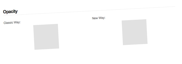
If you've visited the Envato website redesign lately, you might have noticed that there are a lot of transparent elements. Though this is achieved with transparent PNGs, you can achieve a similar effect by using the opacity property. Now, the opacity property has been around for a while, but our beloved IE has its own properties.
Classic Way
- <style type="text/css">
- .box {
- opacity: .6; // all modern browsers (this is CSS3)
- -ms-filter: "progid:DXImageTransform.Microsoft.Alpha(Opacity=50)"; // IE 8
- filter: alpha(opacity=60); // IE 5-7
- }
- </style>
- <div class="box">
- <!--CONTENT-->
- </div>
Aucun commentaire:
Enregistrer un commentaire