 Because of nearly release of stable Firefox 5, first Mozilla's browser with CSS3 Animation support, I decide to create CSS3 demo for the Single Effect Compo.
Since I really enjoy all that 4chan-like mems stuff, I chose Nyan Cat, as one of the most 'fresh' ones. In case you don't know it (check the progress bar!):
I didn't use any graphics to code my CSS Nyan Cat. It is completely drawn and animated in CSS. The 'pop-tart' body is created with two rounded cornered divs and big, pink dots separated with non-breaking spaces:
#toastBody {
    background-color:#fad695;
    width:100px;
    height: 70px;
    border: solid #000 5px;
    border-radius: 15px;
    padding: 2px;
    position:absolute;
    z-index:19;
}

#toastBody > div {
    width:100px;
    height:70px;
    border-radius: 30px;
    background-color: #fc9dff;
    display:block;
    color: #da3eb9;
    font-size: 40px;
    line-height: 10px;
}
All the animations was declared with @-moz/webkit-keyframe (I wrote a lot about this method before). I made couple of unusual things during development. For example, look on the cat's mouth:

Yup, it is rotated 'E' letter:
<div id="mainHead" class="skin">What about the rainbow behind the cat? I just cropped part of original image, put it into CSS Gradient Editor by ColorZilla (awesome tool BTW, but still without couple of necessary features I use daily; I think I will create something like this on my own), which generates me css gradient ready for pasting into the div background:
<div class="mouth">E</div>
</div>
.mouth {
position: absolute;
-moz-transform: scale(2, 0.7) rotate(-90deg);
-webkit-transform: scale(2, 0.7) rotate(-90deg);
font-family: Arial;
font-size: 25px;
font-weight: bold;
top:9px;
left:37px;
color: #000;
}
.rainbow {
 position:absolute;
 width:45px;
 height:90px;
 background: -moz-linear-gradient (top, #d91a12 15%, #e13300 15%, #ff7f14 16%, #f2ab03 32%, #ebc000 32%, #fade00 33%, #efff03 48%, #56fc02 49%, #52ff01 66%, #4ade7e 67%, #3baaf2 67%, #3baaf2 84%, #7337f7 84%, #6b40f2 100%);
}
The most annoying thing was the star. Animated stars in the background are made up from 8 animated elements. I google "nyan cat sprite" and found all the star frames [like this]. The only way to animate it was pixel-perfect animation of each of 8 divs. It took me really lot of time:@-moz-keyframes star1 {
0% { top: 0; height: 5px;}
33.19% { top: 0; height: 5px; }
33.2% { height:10px; top:0; }
49.79% { height:10px; top:0; }
49.8% { height:10px; top:5px; }
66.39% {height:10px; top:5px; }
66.4% { height:5px; top:10px;}
82.99% { height:5px; top:10px;}
83% { height: 5px; top: 15px; }
99.99% { height: 5px; top: 15px; }
100% { top: 0; height: 5px; }
}
@-moz-keyframes star2-3-6-7 {
0% { visibility: hidden; }
16.59% { visibility: hidden; }
16.6% { visibility: visible; }
33.19% { visibility: visible; }
33.2% { visibility: hidden; }
100% { visibility: hidden; }
}
@-moz-keyframes star4 {
0% { left: 0; width: 5px; visibility: visible;}
33.19% { left: 0; width: 5px; }
33.2% { width:10px; left:0; }
49.79% { width:10px; left:0; }
49.8% { width:10px; left:5px; }
66.39% {width:10px; left:5px; }
66.4% { width:5px; left:10px;}
82.99% { width:5px; left:10px;}
83% { width: 5px; left: 15px; visibility:hidden;}
99.99% { width: 5px; left: 15px; visibility:hidden;}
100% { left: 0; width: 5px; visibility:hidden;}
}
@-moz-keyframes star5 {
0% { left: 38px; width: 5px; visibility: visible;}
33.19% { left: 38px; width: 5px; }
33.2% { width:10px; left:33px; }
49.79% { width:10px; left:33px; }
49.8% { width:10px; left:28px; }
66.39% {width:10px; left:28px; }
66.4% { width:5px; left:28px;}
82.99% { width:5px; left:28px;}
83% { width: 5px; left: 15px; visibility:hidden;}
99.99% { width: 5px; left: 15px; visibility:hidden;}
100% { left: 0; width: 5px; visibility:hidden;}
}
@-moz-keyframes star8 {
0% { top: 32px; height: 5px; visibility:visible;}
33.19% { top: 32px; height: 5px; }
33.2% { height:10px; top:28px; }
49.79% { height:10px; top:28px; }
49.8% { height:10px; top:23px; }
66.39% {height:10px; top:23px; }
66.4% { height:5px; top:18px;}
82.99% { height:5px; top:18px;}
83% { height: 5px; top: 15px; visibility:hidden;}
99.99% { height: 5px; top: 15px; visibility:hidden;}
100% { top: 0; height: 5px; visibility:hidden;}
}
.star {
position: absolute;
width: 40px;
height: 40px;
z-index: 10;
}
.star div {
width: 5px;
height: 5px;
background-color: #fff;
position: absolute;
-moz-animation: star1 0.4s linear 0s infinite;
-webkit-animation: star1 0.4s linear 0s infinite;
}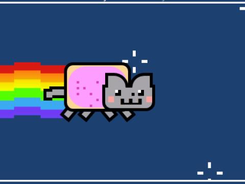
Here is the final result of everything: CSS NYAN CAT, and Github repo. If you like it, don't forget to click "I like it" on Mozilla's page!
Aucun commentaire:
Enregistrer un commentaire